Adding a new interface to banking
UPDATING RBC’S ETMs TO A TOUCH INTERFACE
I was the lead Visual Designer on the SmartATM project team, working on conjunction with UX to research, validate, and iterate on designs while adhering to new technological requirements and business rules.
RBC’s various ATMs/ETMs were numerous and far in-between. They existed in gas stations, as separate kiosks in convenience stores, or in physical branches. Issues began to arise on how scalable these machines would become moving forward, and RBC wanted to invest in new hardware to scale for a better customer experience in the years ahead.
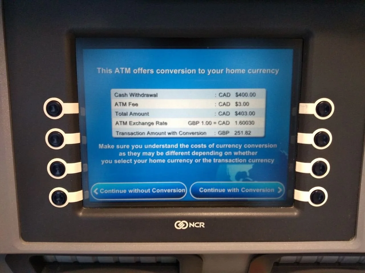
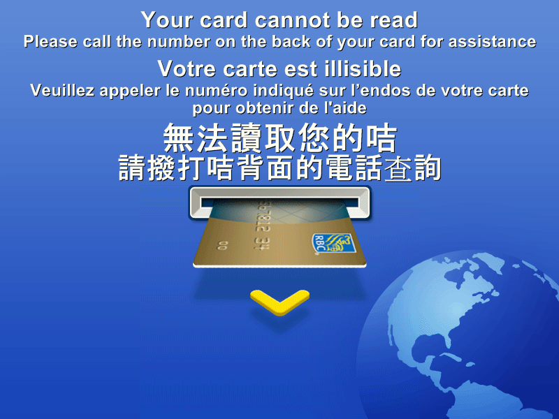
The kiosks used a 8 button interface with keypad. Screens pushed as flat jpegs, so some screens would have “stretched text”.
Issues were starting to arise in terms of content and size of the screen.
Discovering SmartATM
New hardware, new requirements, new branding
As we kicked off the project requirements, RBC was scaling up in hardware from a typical ATM interface to an HTML5 touchscreen with additional hardware requirements (such as: NFC receptor, envelope-free deposits, etc.). Each of these had to be captured and compared to current day functionality.
Analyze, design, test
Iterative design sprints
After requirements gathering, we collected a lot of patterns on how users would navigate through various kiosk experiences through CAN and the US. We discovered that there were common patterns in kiosk experiences.
There was a main navigation rail that grounds the experience. (i.e. a central left navigation or more commonly, a bottom navigation)
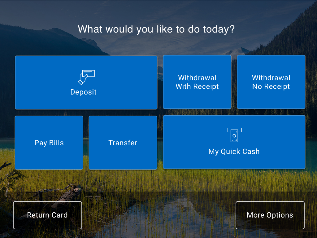
Within the content of the page, there was an array of buttons in various shapes. The size of the button was dependent on how commonly used/popuplar the transaction would be. It would visually catch the attention of the user.
From there we created UX wireframes and tested our results in the ATM lab on the actual SmartATM machines with real RBC customers in iterative testing sprints.
The final design
What did we deliver?
After months of designing and testing, we were able to deliver something that was aligned to RBC’s new brand, could adapt across touchscreen sizes and could scale for the basic interactions that users would be doing at the ATM.
Like our market research, users responded very highly to a "primary navigation” on the bottom rail of the screen. It was there we placed crucial navigation buttons like Back, Cancel, Menu for screen inputs. The content piece of the page would then be divided up into buttons of various sizes dependent on the situation at hand.
Based on testing results, the trending Flat UI design at the time tested very poorly on kiosk interfaces. Users needed to feel confident that the button was indeed a BUTTON before interacting with it. So we devised an entire system with a variety of elevations that organized and prioritized components in relation to its importance. Content/page level buttons is the highest elevation (because they are being funnelled into completing a task), whereas static text would be on the same elevation as the background.


